

There’s no secret anymore that online shops should run perfectly on all types of screens, devices, and browsers.
There’s another important feature for mobile display that not everybody takes into consideration: the thumb zone. It is the most convenient area to touch while using a device with only one hand.
In this article, you will find why this thumb zone is so important and how you can make your online shop more accessible for most of the users.
What is the thumb zone?
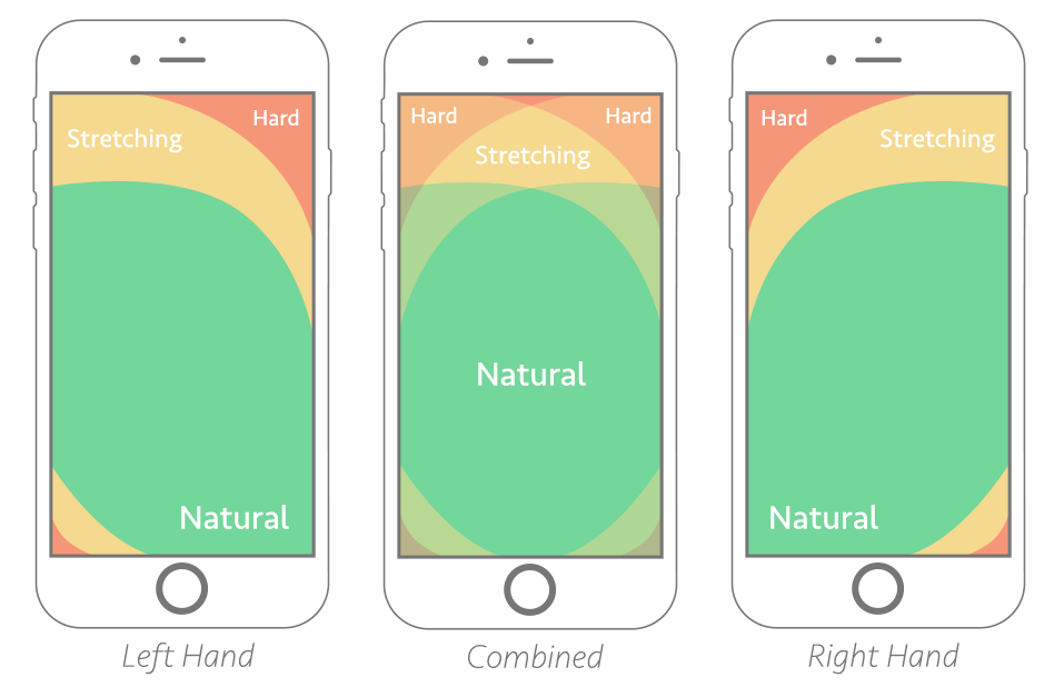
Most importantly, the thumb zone will help you generate a great UX, especially for users that finalize a purchase. Study show people prefer a one-handed activity and no matter how they hold their smartphones, there is an instinctive move for swipe, tap and navigate. Here is how the natural zone works depending on the dominant hand and whether or not both hands are used:
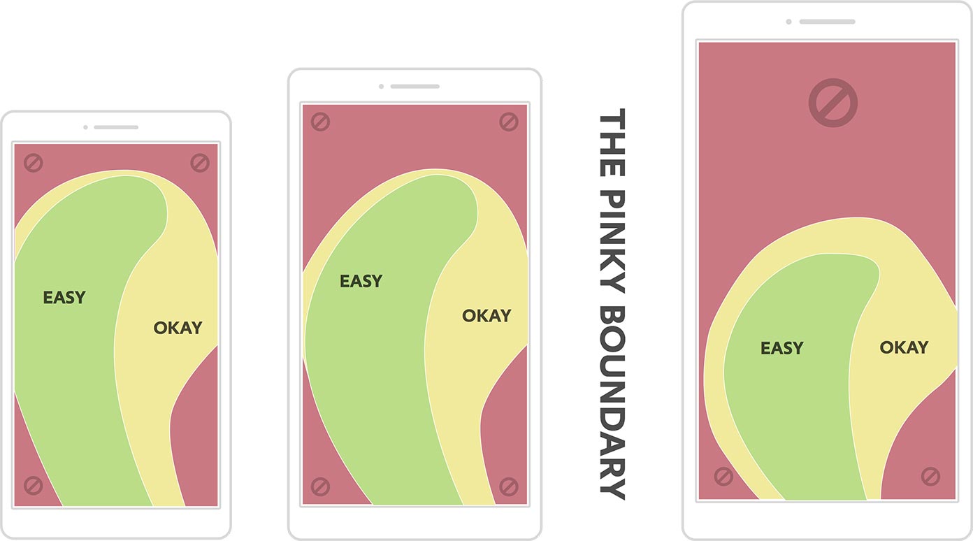
Here is another infographic that shows how thumb zones work differently for different sizes of display. Users with larger displays will find it more difficult to navigate with only one hand.
How to approach the matter
The best thing about working on adjusting the thumb zone is that it won’t affect your overall mobile UX. It will rather increase the usability score and boost conversions.
If you’re looking for adjustments, make sure to:
- Place calls to action on the bottom center – as users naturally look in the area their thumb is.
- Place add to cart buttons below the images, as it is easier for users to tap on them below and not stretch the thumb to reach it.
- Choose a bigger size for links, icons, and text in general, as it is easier to tap on them.
- Make sure there is enough space between hyperlinked items because it is easier for users who use their thumb to tap on the wrong link.
- Install a fix menu along the bottom of the screen – this menu should contain categories, search and checkout and the most important element must be in the center.
- Use non-linked content – this way you will prevent pages full of links and make it easier for users to scroll: use graphics, text and even white space.
Pay attention to actions
Evaluate your website before and after you implement the changes. Use Google Analytics to see conversions on desktop, tablet, and mobile. Google Analytics will also show you user behavior depending on the device.
Another way to get insights is using a heat map that can show you where your users tap and scroll.


